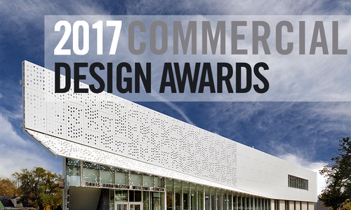
Commercial Design Awards
2016 Commercial Design Awards
Winning commercial spaces that inspire as much as they delight.
By Jennifer Adamson and Ettie Berneking
Jul 2016

Typography by Heather Kane
Jump to A Section
The 9 to 5 grind isn’t so bad when you do it surrounded by beauty. Last winter, we asked designers to show off their most well-designed spaces for our Biz 417 Commercial Design Awards. A panel of judges from the American Society of Interior Designers (ASID) Tennessee Chapter judged the 30 entries based on aesthetics, design and narratives, and our Creative Director Heather Kane toured each finalist to take it all in. Read on to learn a little more about these winning spaces, who were crowned the very best of the best.
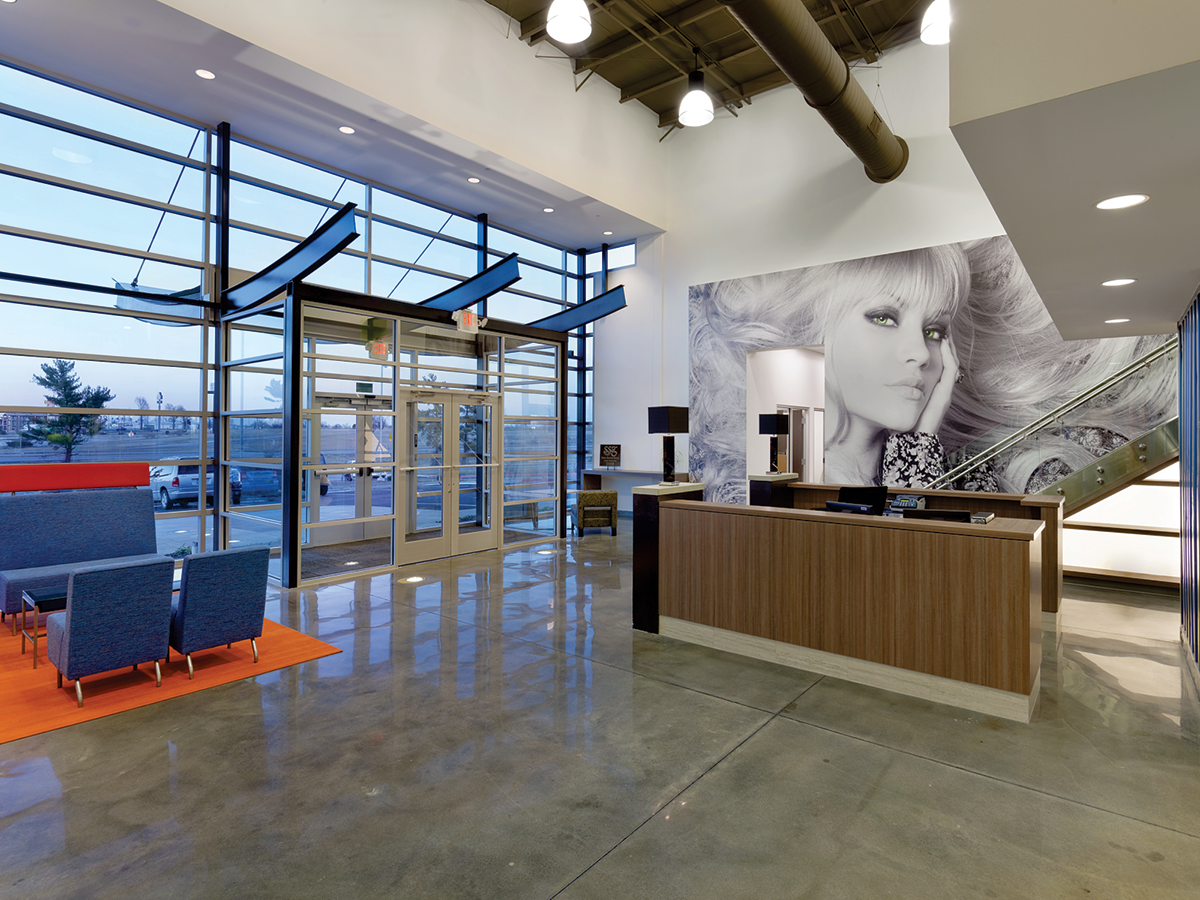
Photo by Gayle Babcock at Architectural ImageworksThe exterior of Salon Service Group is also aesthetically pleasing, with curved metal beams helping set the tone at the front entry.
Category:
General Office Space
Business:
Salon Service Group
Winning Designers:
Jon Dodd, Joyce Buxton and Signey Akins, Buxton Kubik Dodd Creative, 417-890-5543
Space Improvement:
What started out as a large metal warehouse was turned into a multipurpose office, distribution center and retail store that improved workflow and efficiency. The space was also built with growth in mind. By designing office spaces with built-in future growth, the Salon Service Group building can acquire new customers and employees without having to renovate or add on.
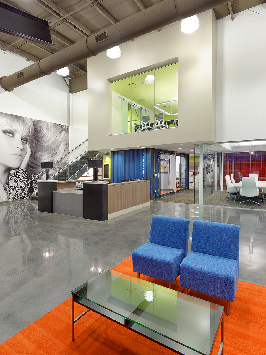
Photo by Gayle Babcock at Architectural ImageworksJon Dodd, Joyce Buxton and Signey Akins of Buxton Kubik Dodd Creative helped bring life and personality to Salon Service Group’s expansive headquarters.
It’s not often you’re called into a meeting that’s hosted inside a beat-up shipping container, but at Salon Service Group, that’s the norm. This unusual office space is the brainchild of Jon Dodd, Joyce Buxton and Signey Akins from Buxton Kubik Dodd Creative, the design team that helped transform Salon Service Group into a corporate headquarters, retail store, warehouse and distribution center. “We spent a lot of time listening to what Gino [Salon Service Group’s owner] and the different departments needed to work together,” Dodd says.
To create this multi-faceted space out of one building, Dodd and the team had to get creative, and that’s where the shipping containers came in. “This company ships products all across the country,” Dodd says. “We thought this was a unique way to create space and storage all at once.” To find shipping containers in the right color and condition, the team worked alongside the building’s contractor and sifted through dozens of photos to find the perfect ones. Not only do the shipping containers serve as meeting spaces, they’re also structural features and support the second-story executive conference room.
Polished concrete floors continue the industrial style that’s balanced out with large murals consistent with Salon Service Group’s products and clientele. Bright pops of color lend an exciting energy to the large industrial building that also boasts the company’s in-house store and salon. Even the outside of the building was given style with the help of curved metal beams resembling eyelashes. “Function was our biggest goal,” Buxton says, as she points out how offices were designed to allow growth within the company.
As it turns out, including that extra space has paid off. In fact, Salon Service Group had to expand its warehouse to meet demand before the initial structure was even finished. Turns out getting creative has paid off big for both Buxton Kubik Dodd Creative and Salon Service Group.
Resource Listing
General Contractor: Larry Snyder & Company, Inc., 417-887-6897
Hardware: Ron Miller Hardware, 417-831-1182
Plumbing Fixtures: Progressive Plumbing Inc, 417-725-1977; Harry Cooper Supply, 417-865-8392
Light Fixtures: Specialty Electric Professionals, LLC, 417-724-9150
Cabinets: KS Wood Products, 417-833-1056
Carpet & Tile: Wilkerson’s Commercial Flooring, 417-865-1010
Polished Concrete Floor: Am-Tech Floors, 417-833-3070
Painter: Elliott Painting LLC, 417-880-6139
Custom Wall Graphics: Designtex, 1-800-221-1540
Drapery: Linda’s Custom Draperies, 573-584-9225
Blinds: Benton Blind, 417-882-1999
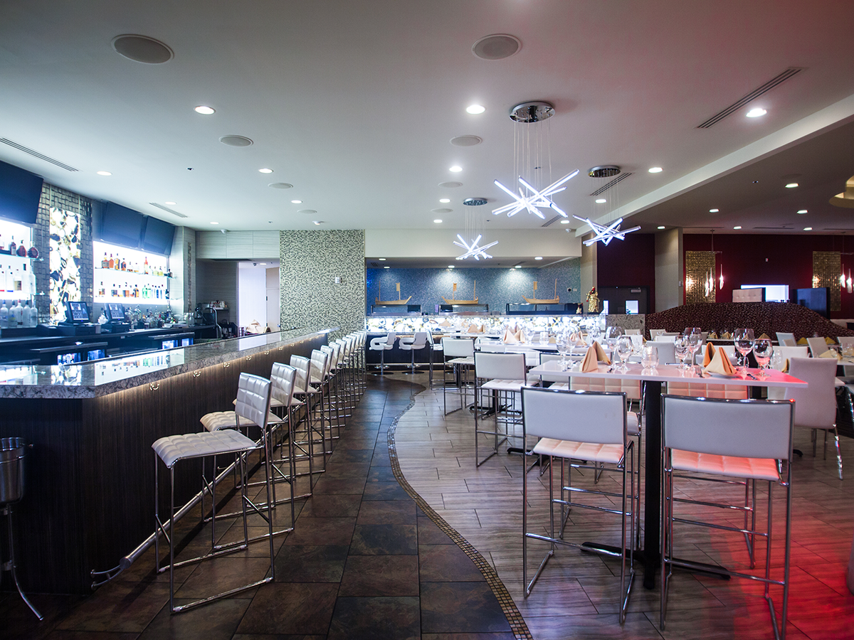
Photo by Elise Randolph PhotographyDiana Werner of D. Werner Interiors outfitted Ocean Zen with white leather furniture and plenty of dangling Swarovski crystals.
Category:
Hospitality
Business:
Ocean Zen Pacific Rim
Winning Designer:
Diana Werner, D. Werner Interiors LLC, Verona, 417-229-1174
Space Improvement:
In place of a cramped and outdated restaurant, the new restaurant has elegance and flexibility within the main dining space and the large banquet area. Intimate seating arrangements can be pushed together to accommodate larger parties without disrupting the flow and atmosphere of the restaurant.
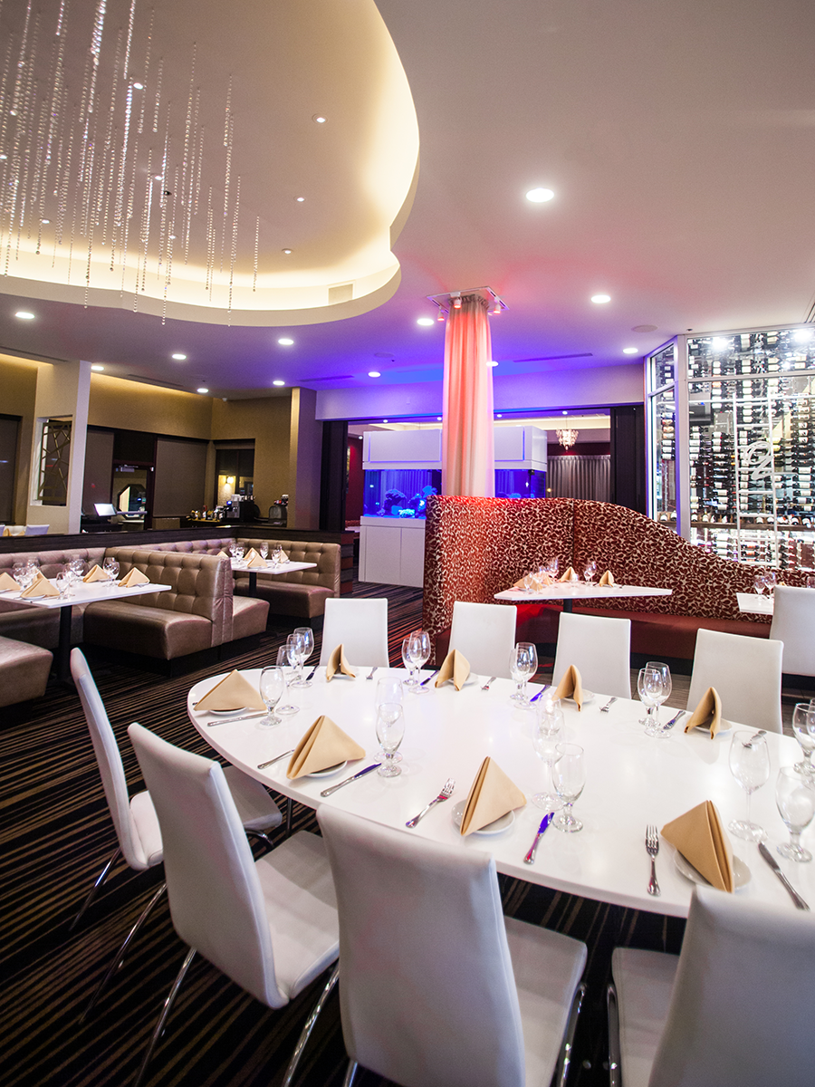
Photo by Elise Randolph PhotographyDiana Werner of D. Werner Interiors outfitted Ocean Zen with white leather furniture and plenty of dangling Swarovski crystals.
It wasn’t that long ago that the once-landmark restaurant Mr. Yen’s closed its doors for good, but it didn’t take long for the massive building to find new tenants. As Ocean Zen Pacific Rim prepared to relocate to the hillside palace along I-60, the Tan brothers hired designer Diana Werner to help refurbish the outdated interior. Months after putting the last white leather booth in place and hanging the last Swarovski crystal from the ceiling, Werner laughs when she thinks about what she saw when she first walked into the shuttered restaurant. “You literally ran into a wall when you walked in,” she says. “But my favorite part was the huge Buddha near the entrance.”
“Judge’s Comments: 'Amazing project! The attention to detail supports the design concept through use of crystals, agate stone and gold details. The custom lighting fixtures continue the ocean theme. I’m ready for sushi!'”— Marcia Knight, ASID
Today, both the wall and larger-than-life Buddha are gone, and in their place are a glamorous and plush dining room and sushi bar that greet customers. To create the stylish new restaurant, Werner and her team gutted the existing space. Walls were torn down, bathrooms were removed, and the kitchen was completely overhauled to make room for the new sushi bar. When it was discovered that two columns couldn’t be removed due to their structural function, Werner wrapped them in light gold drapes and lit them from the top with red lights. The effect turned these structural elements into design features, and Werner continued to repurpose the building’s existing structure when she hung Swarovski crystals from the raised ceiling tray. “The crystals catch the light from the halogen bulbs and mimic a light rainfall,” she says.
Playing off the ocean theme, Werner lined the sushi bar with cut agate stone priced at $300 per square foot. The semi-precious stone is backlit to mimic the scene found on the ocean floor, and light granite countertops give the space a bright, clean finish. Even the white leather seating contrasting with the plush red-and-gold booths gives the updated restaurant a splash of glamour. As the newly remodeled building prepared to open its doors once again, one final touch had to be added. Today, a large painting of Buddha now graces the restaurant’s entrance, where it smiles down on customers once again.
Resource Listing
Hardware: Commercial Hardware, 417-864-7677
Plumbing Fixtures: Fusion Consulting, 417-844-7276
Light Fixtures: Harry Cooper Supply, 417-865-8392; The Light House Gallery, 417-889-1088
Kitchen Cabinets: KS Wood Products, 417-833-1056
Kitchen Appliances: Fellers Food Service LLC, 417-862-0812
Carpet: Bearden Carpet, 417-883-7669
Tile: Unique Tile, 417-725-5515; Bearden Carpet, 417-883-7669
Paint (brand): Sherwin Williams ; Benjamin Moore
Decorative Paint Contractor: Elliott Painting, 417-880-6139
Architectural Molding (Swarovski Crystal): Ethereal Decor, 1-800-753-7489
Custom Booths: Elite Booth, 816-743-8158
Artwork: Mental Metal, 417-450-2607
Drapery: Linda Ballantyne, 417-833-2292
Blinds: Benton Blind, 417-882-1999
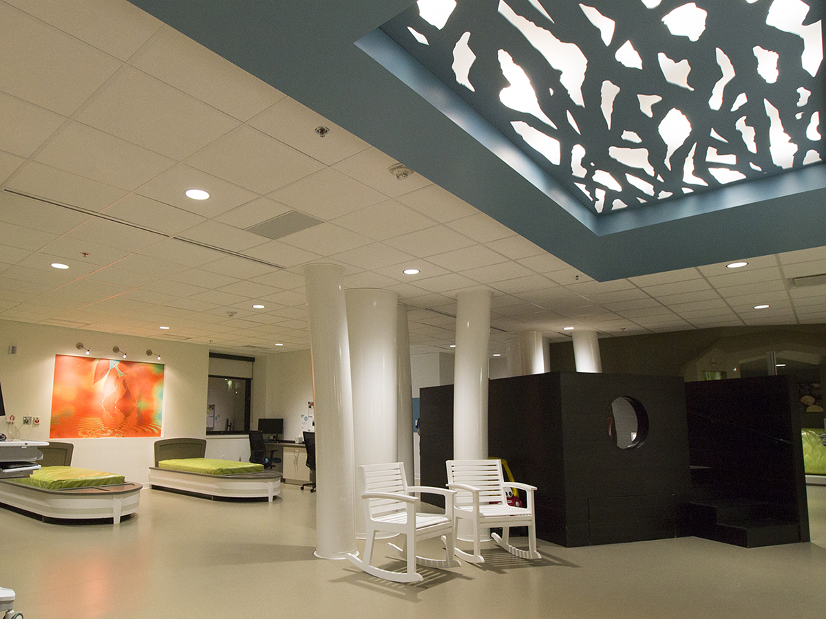
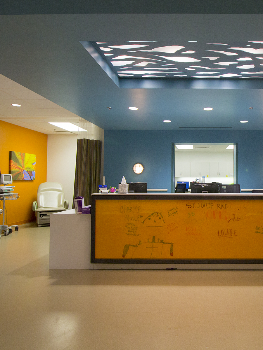
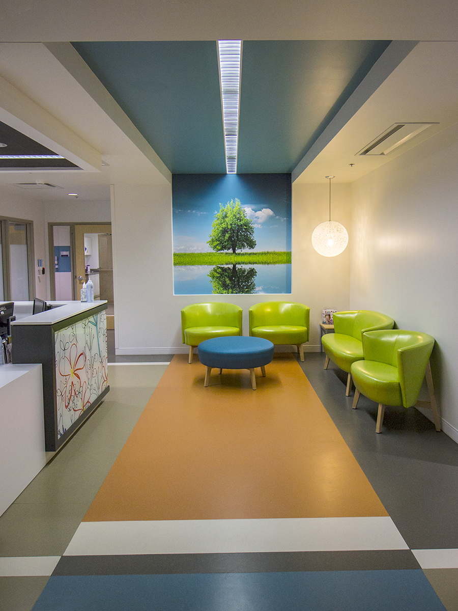
Photo by Brad WilksonBright colors and poppy artwork help make the St. Jude Affiliate Clinic a much friendlier space than traditional hospitals.
Category:
Medical
Business:
St. Jude Affiliate Clinic at Mercy Children’s Hospital
Winning Designers:
Brian Kubik, Joyce Buxton and Brandi Bailey, Buxton Kubik Dodd Creative, 417-890-5543
Space Improvement:
Instead of designing around the traditional hospital concept, this new space for St. Jude was designed with multiple seating and lounging spaces where kids can receive treatments in an atmosphere that is bright, welcoming and far from the usual sterile hospital setting. The new space is designed to accommodate children and their parents thanks to new workstations, playrooms and living rooms.
Photos by Brad Wilkson
(Left) Shades of bright blue, green and orange were used throughout the St. Jude Affiliate Clinic at Mercy Children’s Hospital to coordinate with Mercy’s current branding. (Right) Brian Kubik, Joyce Buxton and Brandi Bailey designed the space with an outdoor theme, so artwork featuring trees and waterfalls helps fill the walls.
For designer Brian Kubik, working on the St. Jude Affiliate Clinic at Mercy Children’s Hospital holds special meaning. Not long ago, Kubik and his wife were at the St. Jude Children’s Research Hospital in Memphis while their son, Cross, battled and eventually won his fight against cancer. That experience made Kubik acutely aware of what needed to be done at Springfield’s affiliate clinic. “This project was a huge deal for Springfield and for Mercy Hospital,” Kubik says. “It was great to give back to a place that saved my son’s life.”
But designing a clinic that feels less like a hospital and more like a play space and living room where kids and their parents could relax was no easy task. “The most challenging aspect was creating a space that matched the outdoorsy theme St. Jude wanted,” Kubik says. “Mercy has a brand, and it’s not outdoorsy.”
To blend Mercy’s clean lines and bright colors with the outdoor retreat St. Jude wanted, the team created an outdoor theme using contemporary materials. The reception desk was wrapped with a floral texture found within Mercy’s brand, and wood flooring was installed along the adjacent wall and ceiling box. A teen cave was added, and pictures of trees and waterfalls were hung on the walls to give it a more natural ambience. White columns were installed between the treehouse and boat beds to resemble modern interpretations of trees where rough bark is swapped for clean, white trunks that jut from the ground. Bright blue, green and orange pop throughout the clinic and coordinate with Mercy’s current branding to create a welcoming and exciting space. Even the Adirondack chairs placed throughout the clinic lend a relaxing outdoor ambience most often found at the end of a dock. “Everything had a purpose,” Kubik says. “That’s what makes St. Jude so special. It’s not like going to a hospital. We were going to make a cancer treatment clinic into a place where kids could go and live a normal life and forget they’re getting treated.”
Resource Listing
General Contractor: McCarthy Building Companies, 314-968-3300
Doors: Negwer Materials, Inc., 314-522-0579
Plumbing Fixtures: Connelly Plumbing, 417-866-2256
Light Fixtures: Sechler Electric, 417-864-5389; Harry Cooper Supply, 417-865-8392
Cabinets: Cohen Architectural Woodworking, 573-265-7070
Carpet: Zickel Flooring, 417-831-3521
Paint: Premium Painting LLC, 417-890-9119
Blinds: Blinds Etc, 417-883-4499
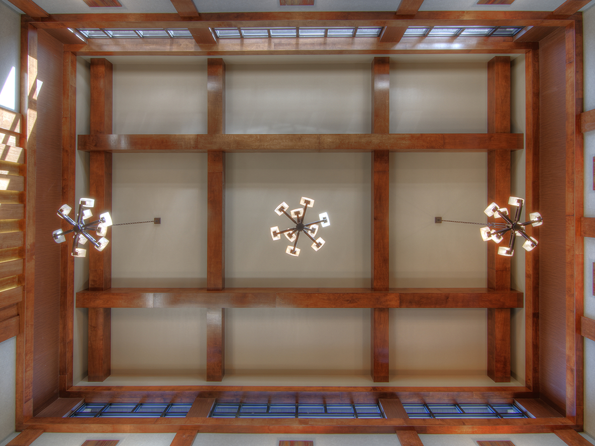
Photo by Scott SloanStephanie Snadon of Slone Architects & Interior Design made sure no detail was overlooked on this project, with custom beams and light fixtures adding interest to the ceiling.
Category:
Financial
Business:
People’s Bank of Seneca
Winning Designer:
Stephanie Snadon, Slone Architects, Architecture & Interior Design, 417-887-4575
Space Improvement:
Noise control is a sensitive matter for financial institutions. With that in mind, designer Stephanie Snadon used acoustical wall covering and carpeting under the desks to help absorb sound reflection and maintain privacy for clients.
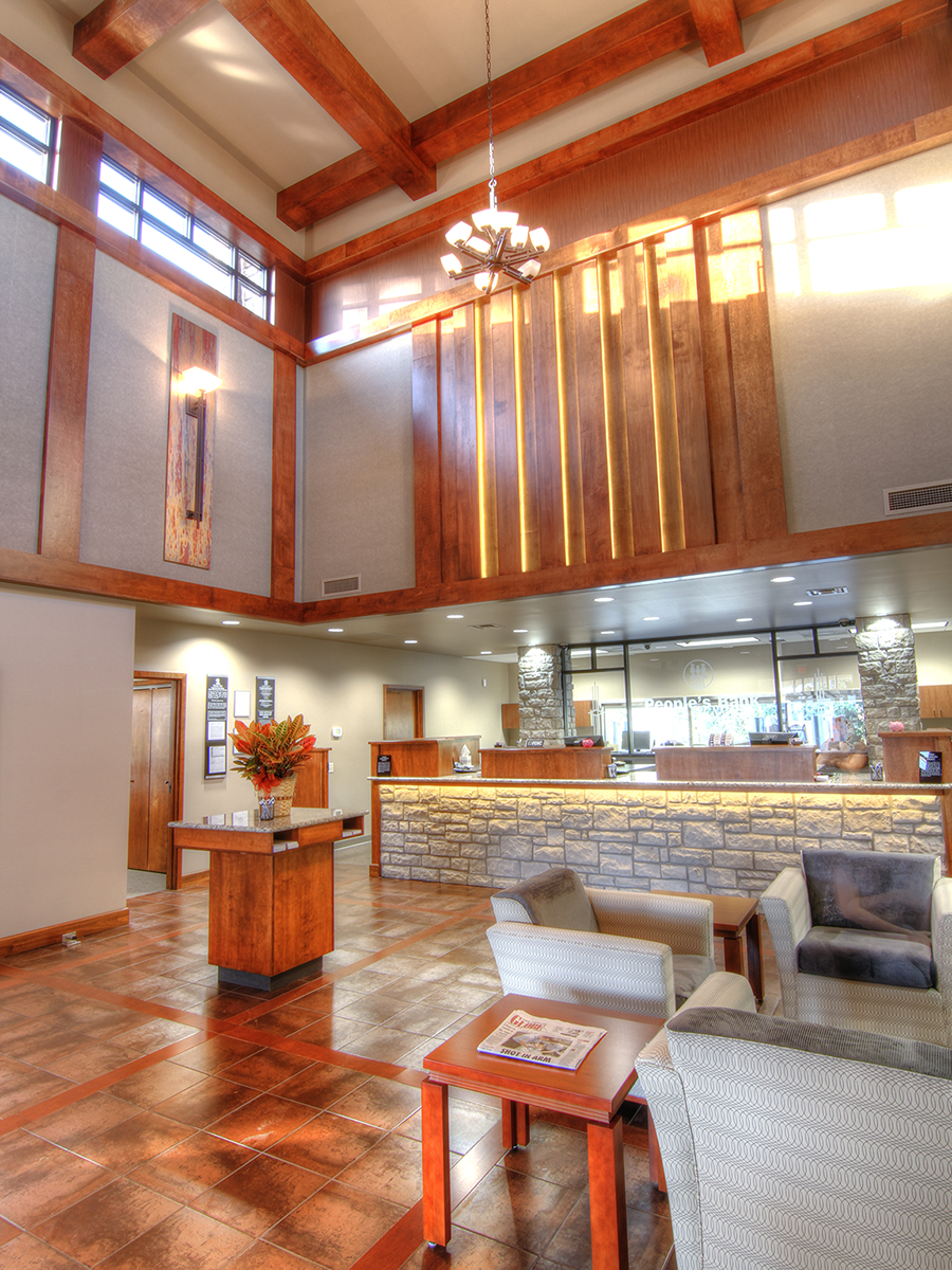
Photo by Scott SloanCustom beams and a variety of wood finishes help bring a bit of coziness to the bank’s lobby, which features 30-foot walls.
In almost all design projects, there’s more than meets the eye. There’s function, durability and longevity, and for Stephanie Snadon, there’s often security to consider. That’s because Snadon has teamed up with several banks over the years to create a more welcoming and modern ambience in her clients’ financial institutions.
When People’s Bank of Seneca started building from the ground up, Snadon already knew what her client’s biggest concern would be: security, specifically visibility throughout the main lobby. To create a clear visual plane, Snadon decided to create two open offices behind the teller station rather than enclosing them in private rooms. Next, Snadon turned her attention to the scale of the building. Thirty-foot ceilings made the space feel more like a cathedral than a bank, so large wooden beams were used to create a grid pattern for a more casual yet elegant atmosphere.
“Judge’s Comments: 'Good selection of materials. Very inviting.'”— Janis Lisle, ASID
Even the sconces, which are 4 feet tall, had to match the towering scale of the walls. “We wanted to make sure you could look up and see something interesting,” Snadon explains. Balancing the natural elements with elegant design features, the teller station is wrapped in faux stone tiles, and wooden planks are staggered overhead and backlit to create a warm and inviting glow. For flooring, Snadon installed porcelain tile peppered with specks of aluminum to resemble patinaed copper, and stained wooden planks were added to match the grid pattern found on the ceiling above. “We wanted to create symmetry without detracting from the main focal points,” Snadon says. Granite countertops and stone pillars add the final touch to the design, and acoustic wall coverings help absorb sound out in the lobby. With natural light pouring in from the vaulted windows, the bank’s lobby is warm and welcoming.
Resource Listing
Architecture/Interior Design: Slone Architects, Architecture & Interior Design, 417-887-4575
Contractor: Federal Construction, 417-862-0622
Electrical/Mechanical Engineering: Latifi Engineering, 417-849-1989
Structural Engineer: Tom Edelman, 417-882-9850
Custom Casework/Millwork: Total Cabinet Solutions (Note: Total Cabinet Solutions has closed since the initial publication of this article.)
Office Furniture: Grooms Office Environments, 417-883-4646
Photo by Jeremy Mason McGrawNathan Taylor of Obelisk Home helped create a comfortable, relaxed vibe at Township 28.
Category:
General Commercial Space
Business:
Township 28
Winning Designer:
Nathan Taylor, Obelisk Home, 417-616-6488
Space Improvement:
The historically urban look of this new apartment complex, including a leasing office that is welcoming instead of intimidating, puts prospective tenants at ease and makes business transactions feel like a conversation around the dinner table.
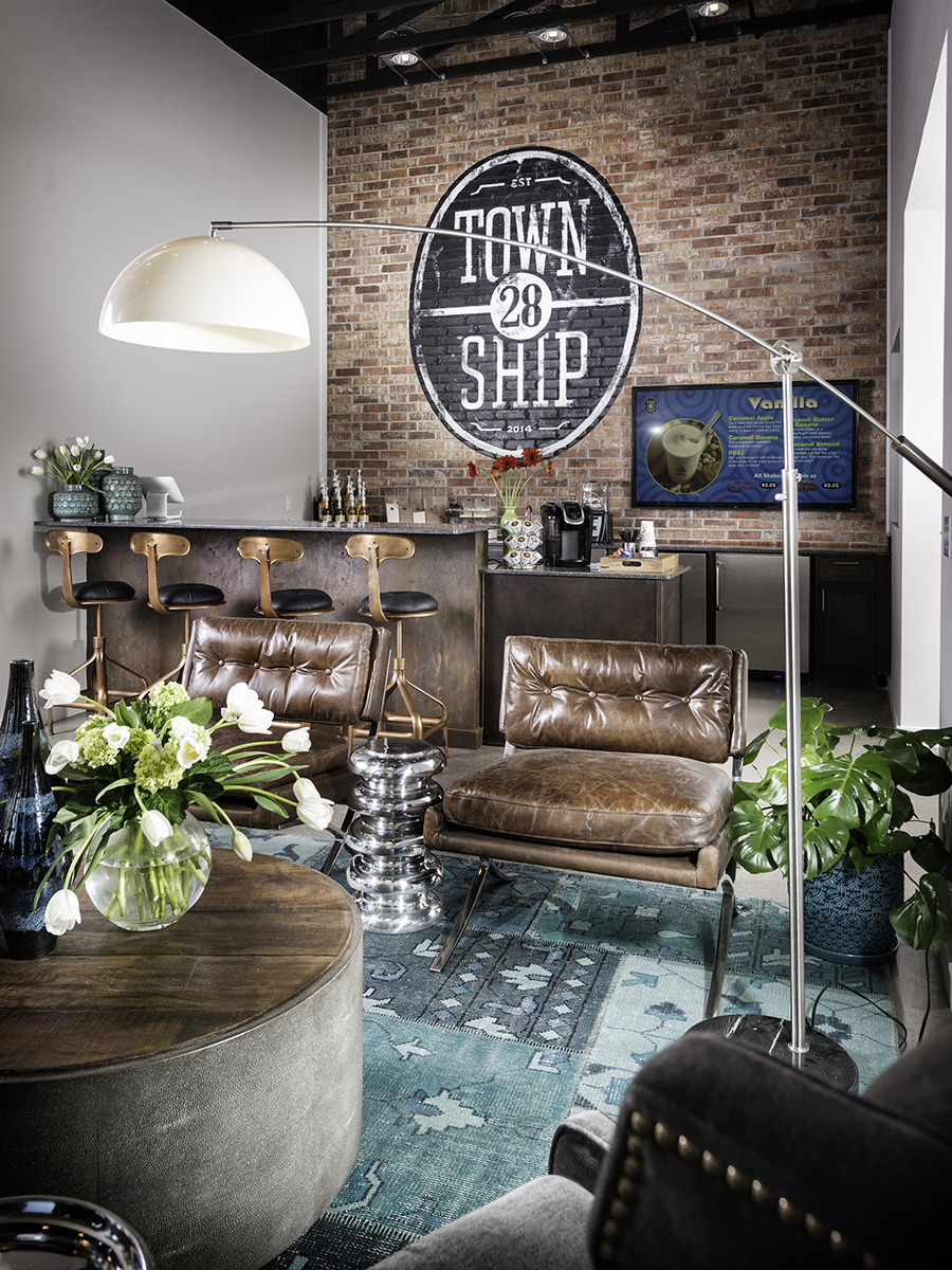
Photo by Jeremy Mason McGrawNathan Taylor of Obelisk Home helped create a comfortable, relaxed vibe at Township 28.
Working in tandem with architects, builders and property owners is part of being a designer. And that team works together to create a unified vision and execute that vision to perfection.
So when representatives from TLC Properties and H Design Group asked Obelisk Home Designer Nathan Taylor to join them in building modern apartments and a leasing office with an eclectic interior, Taylor knew his design process was a perfect match for the partnership and for the new project. “People come to us and say, ‘We have this, this and this, and we want this, so how do we get there?’” he says. “We take that information and create a new vision that should ultimately be a combination of everybody’s wishes and thoughts.”
The collaboration led to Township 28, Springfield’s newest apartment community located on South Lone Pine Avenue near Sequiota Park. At the center of the complex is a 2,700-square-foot leasing office, service office and gym showcasing Taylor’s handiwork. The goal was to create several conversation areas within the space, including a few spots to conduct business, but lessen the commercial vibe with comfortable seating, accent furniture and accessories that could just as easily be found in a family room. But because this is a commercial space, the exposed truss ceiling, polished concrete floors and mixed metal accents suggest an industrial feel without distracting from the space’s residential look.
“Judge’s Comments: 'The finishes and overall details do a beautiful job providing the clean, modern look requested by the developer and architect. The historic photos, leather, reclaimed wood and iron depict the overall concept very well.'”— im Costner, Allied ASID, NKBA, CAPS, Certified Aging in Place Specialist
The developer also wanted the leasing office to feel like an old neighborhood grocery store, so distressed leather chairs, reclaimed wood tables, historical photos of Springfield and a brick accent wall were blended into the design.
Outside, H Design Group added matching brick, storefront glass and a wraparound awning, which pay homage to the industrial and commercial facilities that dominated the area before a recent surge in redevelopment. The living units are made of brick, and Taylor chose paint colors which resemble authentic row houses. “The desire was to make it look like, over the history of time, several different people all built next to each other,” Taylor says. Combined with the design of the leasing office, this property elicits modern-day nostalgia.
Resource Listing
Office Furniture: Obelisk Home, 417-616-6488
Lighting: Obelisk Home, 417-616-6488
Kitchen/Breakroom Appliances: Metro Appliances & More, 417-833-1113
Polished Concrete Floors: Am-Tech Floors, 417-833-3070
Paint: Sherwin-Williams Paint Co., 417-882-6429
Decorative Paint Contractor: Breedlove Designs, 417-849-1636
Artwork: Obelisk Home, 417-616-6488